
HEALTHTECH · CONCIERGE HEALTH · FRAMER · 2-WEEK SPRINT
Rareform
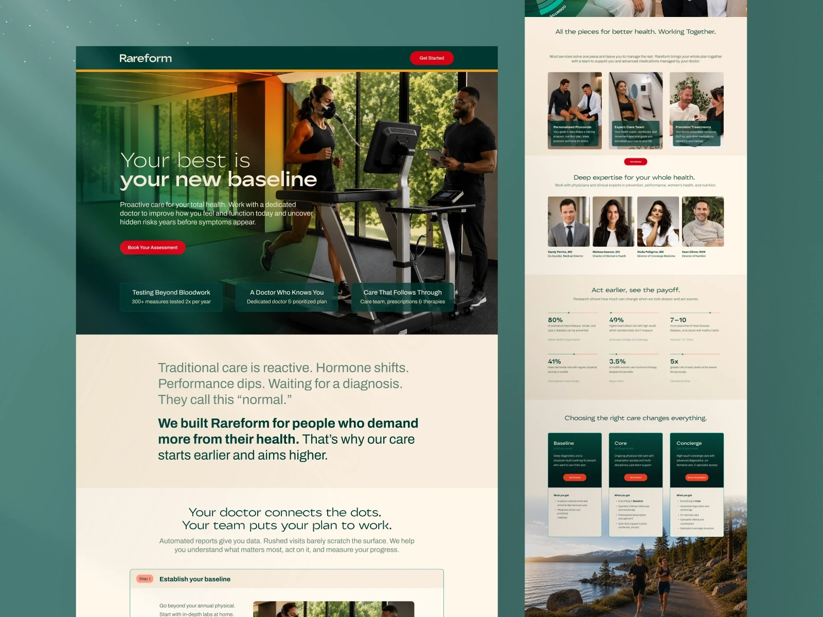
Rareform is built for people who have outgrown traditional healthcare. Their patients are high-achievers who want proactive, personalised care, not reactive triage. The brief was a single landing page that positioned the platform clearly against conventional medicine, communicated clinical credibility and personal warmth simultaneously, and converted visitors into consultation bookings. Foundrline designed and built the full page in Framer across a Mini Sprint — visual identity, messaging architecture, UI/UX design, and responsive development delivered in under two weeks.
CLIENT: Rareform — Premium concierge health platform. Direct-to-consumer, serving high-achievers who demand proactive, personalised, whole-health care.
MINI SPRINT: Design and development delivered in under two weeks.
PLATFORM: Framer, Figma
SCOPE: Brand direction · Visual identity · Messaging architecture · UI/UX design · Custom photography art direction · Conversion structure · Responsive Framer build
CORE PROBLEM: Premium healthcare has no credible visual language to occupy. Clinical looks like a hospital. Warm looks like a wellness brand. Rareform needed to look like neither, and to make that position feel earned, not claimed.
OUTCOME: Single landing page live in Framer. Full conversion journey handled in one scroll, from awareness through trust-building to consultation booking. Post-launch performance data to be documented on completion of early traffic cycle.
Your website is not a brochure. It is the first time a potential patient decides whether you are worth their trust. Getting that right matters more than getting it fast — but at Rareform's scale, it had to be both.
Designing for the Space Between Clinical and Warm
What should a concierge health platform landing page include?
A concierge health platform landing page should open by naming who the platform is for, establish a care philosophy that contrasts with conventional medicine, show named practitioners with real credentials, list specific conditions addressed rather than claiming 'comprehensive care,' and place proof elements before the page midpoint rather than at the bottom. The conversion architecture should use a consultation-first CTA, not a direct purchase or trial signup, and ideally a softer intermediate conversion point, such as a health diagnostic, before the booking ask.
Section 1 — The Positioning Gap in Premium Healthcare
Why is healthcare landing page design harder than most other categories?
Healthcare design operates under a tension most consumer categories do not share. On one side is clinical authority — precise, credentialed, competent — which communicates expertise but lacks humanity. On the other is wellness — warm, aspirational, lifestyle-forward — which communicates care but rarely communicates specificity. Most health platforms default to one register or the other and underperform with buyers who are looking for both simultaneously.
The premium concierge health market makes this tension sharper. Patients seeking concierge care are typically high-achievers who have become disillusioned with the reactive, triage-model care that traditional healthcare delivers. They want a doctor who treats the person, not the symptom. They want proactive management, not crisis response. And they want the platform they engage with to reflect that ambition in its design and language — not just describe it in its service copy.
The practical consequence is that a concierge health brand cannot borrow its visual language from the categories around it without inheriting the positioning of those categories. A palette and typography system that reads as clinical will attract the same trust — and the same skepticism — as a hospital. A palette that reads as wellness will attract buyers who are looking for a supplement, not a care team.
Most health platforms look like a hospital or a spa. Rareform needed to look like neither — and to make that position feel earned rather than claimed. The visual and verbal language had to communicate clinical precision and personal warmth in the same breath, without either one cancelling the other out. — Anush N, Foundrline
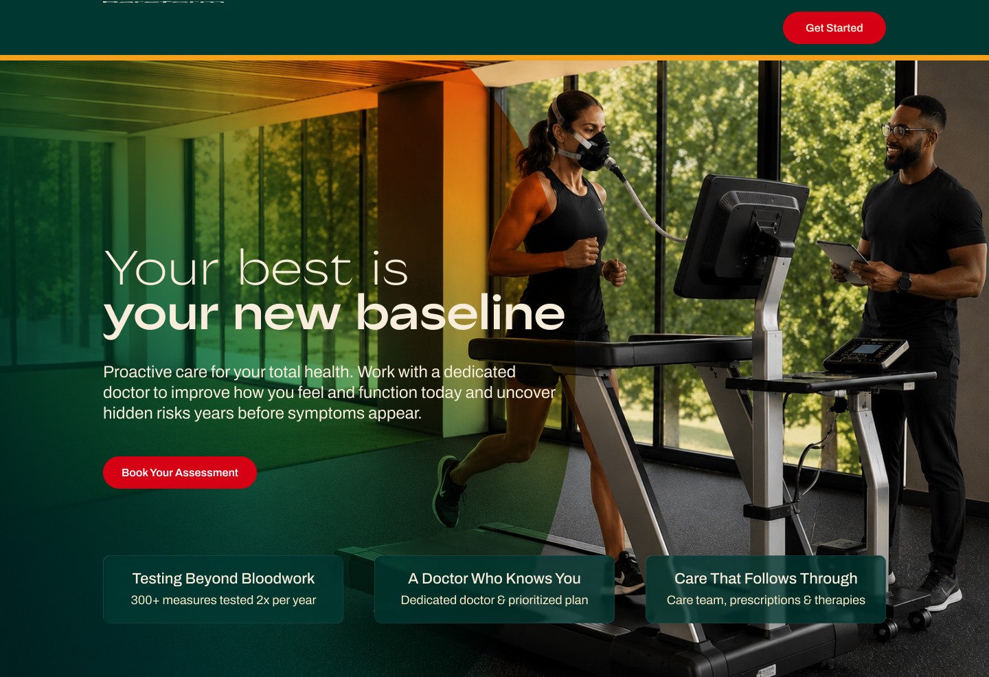
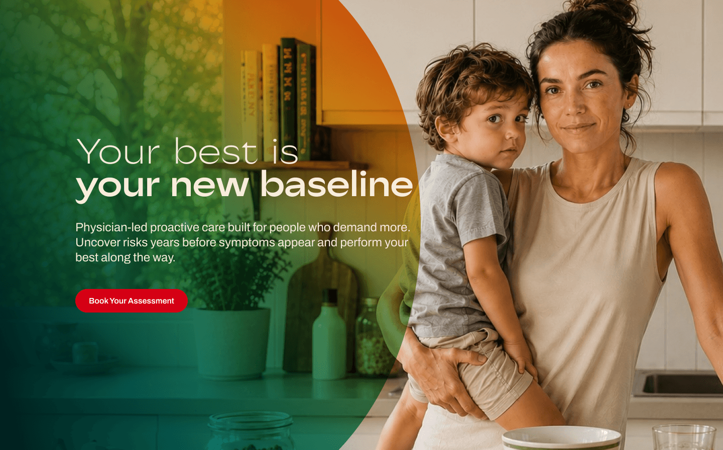
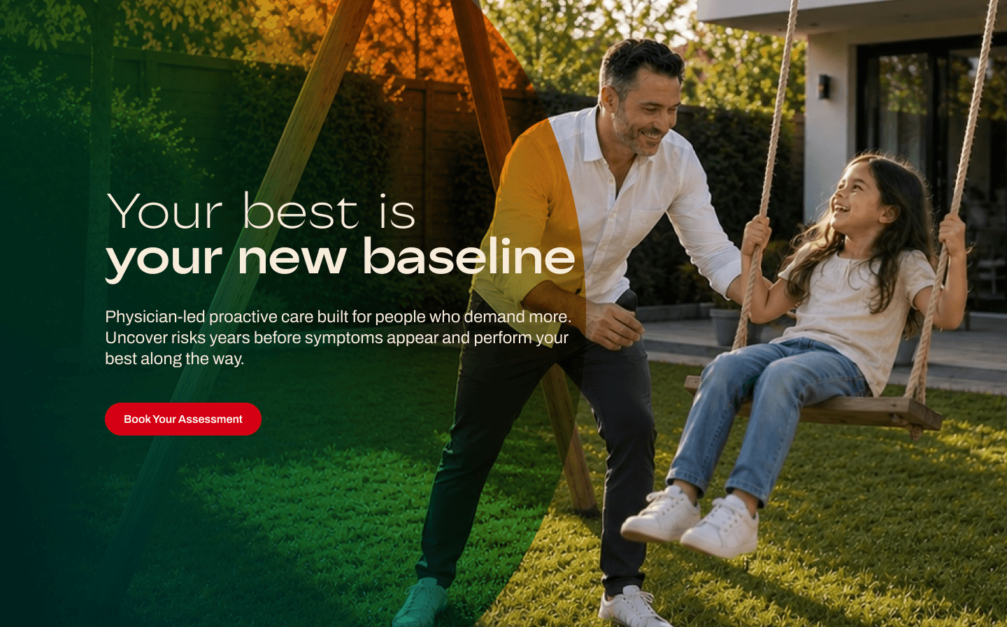
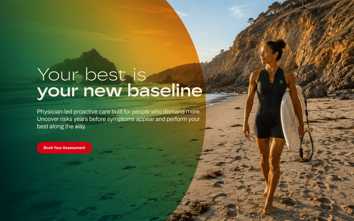
THE HERO — WARMTH AND PERFORMANCE IN ONE FRAME Rareform's page opens with 'Your best is your new baseline' set over a real outdoor landscape photograph. Not a clinical stock image. Not a green-juice flat lay.


Section 2 — The Brief and the Mini Sprint Constraint
What can a Mini Sprint realistically deliver for a health platform?
A Mini Sprint at Foundrline runs under two weeks. For a single landing page at Rareform's scope - visual identity, messaging architecture, full UI/UX design, and responsive Framer build, that timeline is tight but achievable if the diagnostic establishes the right answers before a line of design is produced.
The constraint of a Mini Sprint changes how decisions are made. There is no time for exploring multiple visual directions and narrowing down. The diagnostic has to identify the right visual register on the first pass. The messaging hierarchy has to be locked before design begins. And the Framer build has to run concurrent with design review , sections being built as the upstream sections are finalized, not waiting for a complete handoff. For Rareform, that meant establishing three things in the diagnostic before anything was designed: the buyer profile, the visual register, and the conversion model. Everything else followed from those three decisions.
A Mini Sprint forces a different kind of precision. There is no room for a direction that almost works. The diagnostic has to surface the right answer not a range of options to be narrowed down later. — Anush N, Foundrline
Section 3 — The Design Decisions and Why They Matter for Your Business
The visual system: warm authority
The Rareform visual system is built on three deliberate decisions. The first is the colour palette: off-white cream base with forest green as the primary accent. This combination reads as natural and premium without the cold sterility of white-and-blue clinical design or the lush excess of green-heavy wellness brands. It signals health as an integrated, environmental concept rather than a corrective one.
COLOUR AS POSITIONING, NOT DECORATION: The cream-and-forest-green system works specifically because neither colour carries strong clinical connotation. Medical-grade design uses white, grey, and blue — colours that signal precision and cleanliness. Rareform's palette deliberately avoids that register, replacing clinical with warmth while the page's structure — practitioner grid, conditions list, proof stats — supplies the clinical credibility the palette defers. The visual system and the content structure divide the trust-building labour.
The second decision is photography-first design. Every major section anchors on real photography — practitioners in consultation, patients in natural outdoor environments, a team of visible and named clinicians. At a premium price point, buyers need to see the people behind the service before they commit to a conversation. Stock photography would have undermined exactly the specificity that makes Rareform's positioning credible.
The third is the typography: a serif-humanist pairing. The serif carries the weight of credentialed content; the humanist keeps the page readable and personal. The same pairing is used by premium editorial brands and high-trust financial platforms — it signals content worth reading carefully, not scanning past.
For your business: if your visual language does not immediately signal 'this is for someone like me' to your ideal buyer, you are losing prospects before the conversation begins. A visual system built around your buyer's trust framework — not around what looks good in isolation — is the difference between a website that positions you and one that merely represents you.

Messaging: anti-positioning over self-positioning
Rareform's most persuasive line is not about Rareform. It is about the alternative: 'Traditional care is reactive, formulaic, triage. They treat the symptom. We treat the person.' A visitor who recognises themselves in that description — who has spent years feeling like a set of symptoms rather than a person — has already been given a reason to act before a single Rareform benefit has been stated.
How do you write messaging for a premium health brand without sounding like a hospital or a wellness brand?
Write about the patient's situation, not the product's features. A hospital brochure describes the service. A wellness brand describes the feeling. A premium health platform that has done its positioning work describes the specific failure mode the patient is currently experiencing — and the specific transformation on the other side. For Rareform, that means 'Your doctor communicates the data. Your team puts it all together' — a sentence that names the fragmentation problem in traditional care and positions Rareform's team model as the structural answer.
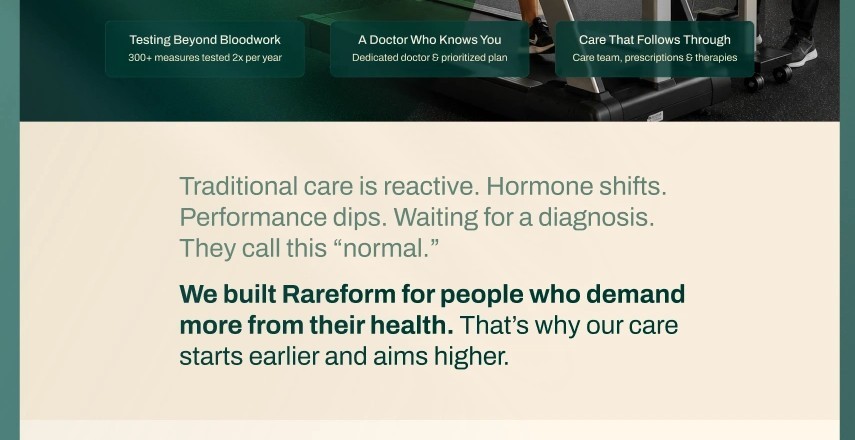
THE CARE PHILOSOPHY SECTION — SPECIFIC, NOT ASPIRATIONAL Below the hero, Rareform does not lead with a brand story or a list of services. It leads with a direct contrast: 'We built Rareform for the people who demand more from their health. That's why our team puts us far and away higher.' Followed by 'Your doctor communicates the data. Your team puts it all together.' Two sentences. One names the audience. One states the mechanism. The product is introduced through the problem it solves, not through a description of what it does.
For your business: if your category has a status quo that your buyers are frustrated with, naming it precisely is more persuasive than any claim you can make about yourself. Most businesses avoid this because it feels risky to criticise an industry they operate in. It works because buyers who recognise their frustration in your description feel understood — and understood is the first step toward trusted.
Section 4 — Page Architecture and Conversion Flow
How should a concierge health platform structure its landing page conversion flow?
Concierge health platforms use a consultation-first conversion model — the visitor does not purchase directly, they book an assessment or call. This changes the page architecture significantly. The conversion ask is softer than a direct-purchase CTA, which means the page has more work to do before introducing it. The visitor needs to feel understood, see clinical credibility, and recognise their specific situation in the content before they will give their details for a conversation.
The Rareform page follows a deliberate trust-escalation sequence: aspiration (hero establishes the vision and the contrast), philosophy (care model and team approach explained), conditions (specific health areas named — giving different visitor segments a recognition moment), practitioners (named, photographed, credentialed), proof (stats before the midpoint), care pathways (options presented as choices), diagnostic CTA (softer intermediate conversion), FAQ (handles objections from interested but undecided visitors), and consultation booking (the final ask, earned rather than demanded).
THE CONDITIONS GRID — SPECIFICITY AS TRUST A two-column grid names the specific conditions Rareform addresses: Longevity, Healthspan, Hormones, Athletic Performance, Weight, Cardiovascular, Brain Health, Gut Health, Sleep — alongside a corresponding specialisms list for the practitioner team. This section does something most concierge health platforms skip: it gives the visitor a specific recognition moment. A visitor with a hormonal concern or a sleep problem sees their situation named explicitly, which converts an abstract 'comprehensive health' claim into a specific relevance signal. Recognition converts. Aspiration does not.

THE PRACTITIONER GRID — CLINICAL CREDIBILITY MADE VISIBLE A dedicated section presents Rareform's practitioners with real headshots, named titles, and stated specialisms. Not a testimonials section. Not a 'meet the team' placeholder. A clinical authority section — each practitioner presented as a specific, skilled individual with a named area of expertise. This is one of the highest-trust-building sections on the page because it replaces an abstract claim ('expert care') with visible, named, credentialed people.
PROOF AT THE RIGHT MOMENT — BEFORE THE MIDPOINT The stats row (85% / 47% / 7–10 day onboarding / 41% / 3.5% / 5+ specialisms) appears roughly at the page midpoint — before the care model presentation and the conversion sections. In health, the visitor's decision to continue reading is made early. Proof placed at the bottom of a long page is never seen by the visitors who needed it most. Placing it before the midpoint ensures it does its job at the moment of maximum evaluation, not after.
TWO-STEP CONVERSION — DIAGNOSTIC BEFORE BOOKING Before the final consultation CTA, Rareform offers 'See where your health stands' — a health diagnostic that requires less commitment than a full booking. This intermediate conversion point captures visitors who are interested but not yet ready to commit to a call. It also creates an engagement loop — a visitor who completes the diagnostic has invested time and attention, making the subsequent consultation ask significantly more likely to convert. Two-step conversion architecture on a single page, implemented without visual complexity.
For your business: most landing pages are structured around what the business wants to say, not around the sequence of belief a buyer needs to build before they act. The Rareform architecture — recognition before proof, proof before ask, soft ask before hard ask — is a transferable model for any high-trust category where the buyer needs to feel understood before they will consider a conversation.
Section 5 — What Rareform Reveals About High-Trust Category Design
What makes high-trust category design different from standard B2C design?
In high-trust categories — health, legal, financial, educational — the buyer's risk perception is fundamentally higher than in most consumer markets. The cost of a wrong decision is not a return and a refund. It is time, health, money, or safety. This raises the trust threshold for every element of the page, and it changes the order of operations for conversion architecture.
In standard B2C design, you can lead with the product and let the brand build trust over time. In high-trust categories, trust has to precede the product introduction. A visitor who does not trust the source of the offer will not evaluate the offer. This means proof architecture — how and when trust signals appear, how specifically they are expressed, and whose face and name are attached to the claim — is load-bearing, not supportive.
How do you design for premium health without looking like a luxury wellness brand?
The distinction is specificity. Luxury wellness brands are deliberately non-specific — their language is aspirational and their imagery is abstract because their proposition is a feeling. Premium health platforms serve buyers who want outcomes, not feelings, which means every design element has to carry specific content: a named practitioner, a named condition, a named mechanism, a named result.
The Rareform page achieves this through the combination of its real photography (specific people in specific contexts), its conditions grid (a named list rather than a category claim), its practitioner section (named individuals with stated specialisms), and its care philosophy copy (a named contrast with a named failure mode in conventional care). Each element adds specificity. None of them add atmosphere without content.
In health design, credibility is not built by claiming expertise. It is built by showing who, specifically, is behind the service — what, specifically, they treat — and what, specifically, the patient's experience will be. Generic claims of 'comprehensive care' are trust-negative in this market. They read as evasion, not confidence. — Anush N, Foundrline
Section 6 — Five Principles for Health Platform Landing Page Design
Distilled from the Rareform engagement — and applicable to any high-trust consumer category.
1. Establish the visual register before any design begins
Clinical, wellness, or the territory between them — this decision determines palette, photography style, typography, and section structure simultaneously. Getting it wrong early is expensive to reverse. The Rareform diagnostic identified the warm-authority register on the first pass because the buyer profile and care philosophy were confirmed before a design direction was explored.
2. Anti-positioning is more persuasive than self-positioning
'We treat the person, not the symptom' is more persuasive than any direct claim about Rareform's quality of care because it names what the alternative delivers and lets the visitor decide which they would prefer. The strongest positioning in high-trust categories does not describe the brand — it describes the status quo the buyer is ready to leave.
3. Proof architecture matters more in high-trust categories than anywhere else
Named practitioners, specific conditions, and quantified outcomes need to arrive before the page midpoint — before the visitor's decision to continue reading has been made. Proof at the bottom of the page serves visitors who have already decided to convert. Proof before the midpoint serves the visitors who are still deciding.
4. Specific recognition beats broad relevance
A visitor who sees their specific condition named converts at a higher rate than a visitor who reads that the platform offers 'comprehensive care.' Every claim that can be made specific should be. Every section that can give a visitor a recognition moment should be designed to do so.
5. A Mini Sprint is viable for a single landing page when the diagnostic is right
Two weeks is achievable for a page of this scope when the visual register, messaging hierarchy, platform, and conversion model are confirmed before any design work begins. The diagnostic is not a preliminary step — it is the work that makes the execution possible at sprint speed without sacrificing quality.
A health platform landing page is not a brochure. It is the first clinical interaction the patient has with the service — and it has to create enough trust for them to take the next one. — Anush N, Foundrline
About This Engagement
Rareform was delivered as a 2 WEEK SPRINT — visual identity, messaging architecture, UI/UX design, and Framer development in under two weeks, from diagnostic to live page. Post-launch performance data will be incorporated into this case study as it becomes available.
If your platform is communicating at the wrong altitude — too clinical, too aspirational, or somewhere undefined between the two — that is a positioning problem before it is a design problem.
A sprint diagnostic takes thirty minutes and tells you exactly what your site needs.




Our Client From Different Industry